Why use the Kanban Charts Jira App?
|
Those familiar with Kanban metrics will already be aware of the significance of various charts including the scatter-plot chart, work in progress and others. If you already use our Work item Essentials app, you will know exactly what the idea is here. If you are not familiar with Kanban concepts I strongly recommend you read the kanban guide by ProKanban. You can thank me later :-)
The Kanban Charts app brings you some essential charts starting with the cycle time scatter plot chart. This chart is probably the most important chart for a Kanban management practitioner and should not need explaining but if you really need one then have a look here. The app is available on the Jira Marketplace. |
How to set up and use the Kanban charts app
This is our second app on the Jira Marketplace and while I thought setting up and using the Work Item Essentials app cannot be any easier, I have to say that the Kanban charts app is indeed easier. Once you have it installed in your Jira instance simply go to the config page, select the issue types you want to include (e.g. Story, Bug, Task) and then select your Cycle time field. If you already have Work item Essentials app installed then the "Work Item Age" field will be available to you. When an issue (a ticket in Jira) reaches its Done status then the "Work Item Age" stops increasing and thus becomes the Cycle time for your completed issues. But of course you're welcome to use your own cycle time field as there are various ways you may calculate that. You could even use your Story Points estimate filed here, though for Kanban ideology reasons I do not recommend it :)
In your chart area then, you can select a date range for your chart and the number for your percentile line. Now, once again, if these concepts don't mean much, do head over to the prokanban website to read a little more about it.
There's also a handy refresh button to redraw your chart if needed.
When you have some completed issues with a Cycle Time field that aren't empty, your charts will start showing. See below for examples.
Currently, we offer 2 charts so make sure to read to the end of this page. Goes without saying that over time we will be building more charts to make this app more valuable.
Here's a step by step guide with screenshots.
Completed Work Items Scatter Plot
These are the steps to configure and use the scatter plot chart. As you will see in the steps below the configuration is customisable to include the Jira issue types that you care about and you can select a numeric field to use for Work Item Age which could of course be some other field - e.g. like Story Points (did I just write that!!) :-)
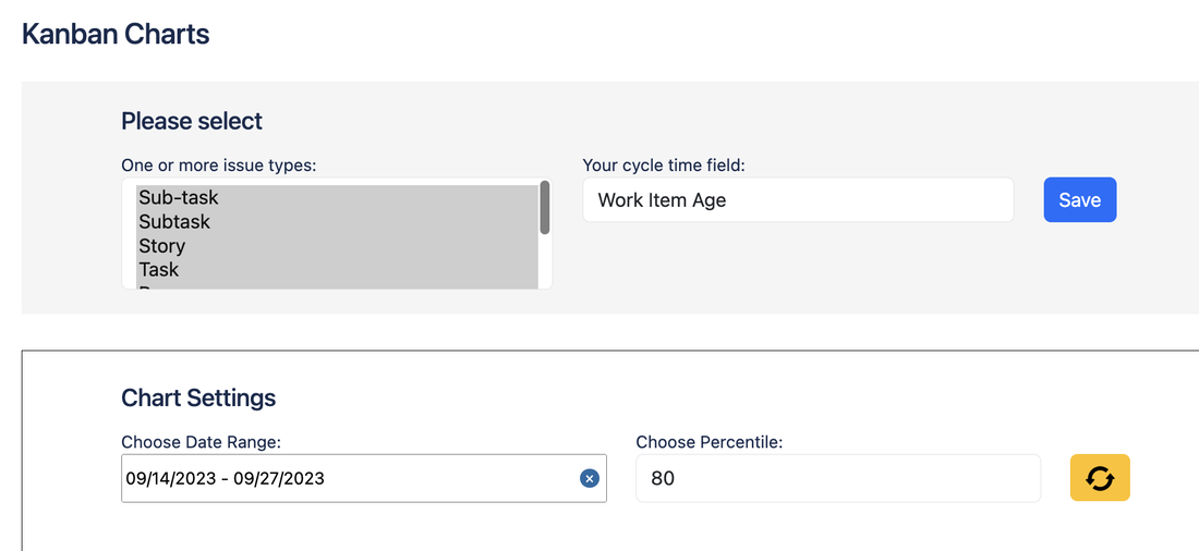
Kanban Charts configuration section
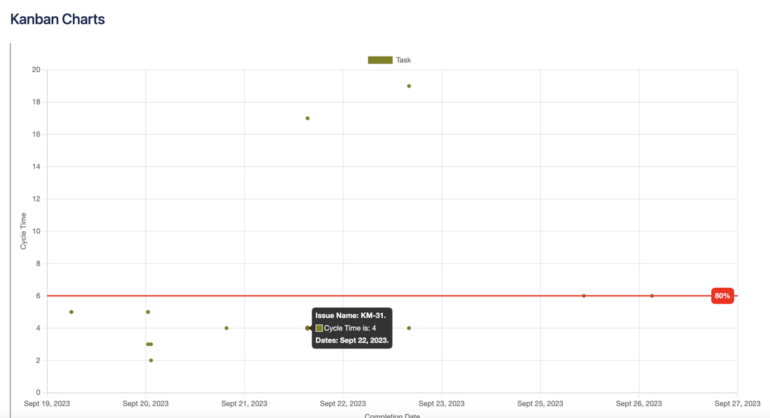
An actual scatter-plot using my test data.
You can see I have the percentile line at 80% and the little pop-up with issue details which shows up on hover over (neat, right?)
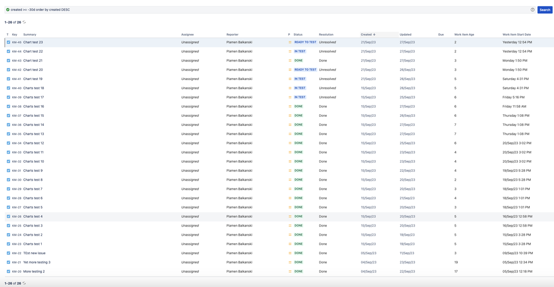
Kanban Charts - here are all my test issues that I used to produce the above scatter-plot
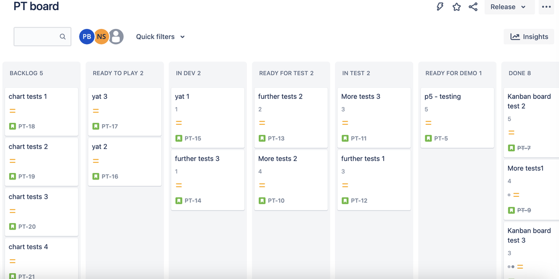
Kanban charts - and for the Kanban nerds (like me), here's a board with the Work Item Age showing on each card.
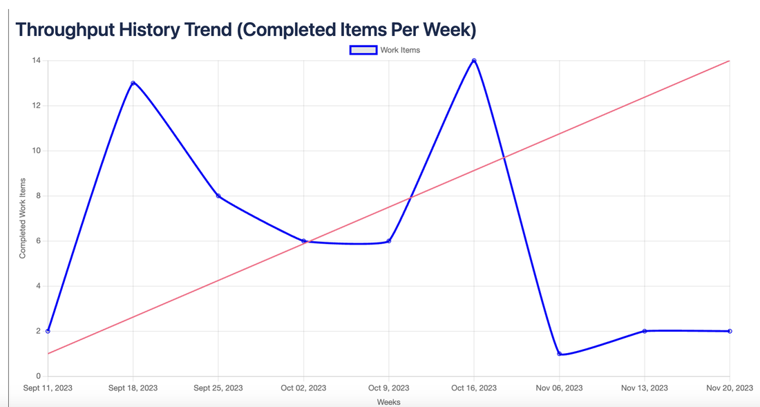
Throughput History Trend
This chart doesn't need additional configuration and will just pick up the selected Jira Issue types and the date range you have already used for the ScatterPlot. Here's how it looks.
The Kanban charts app is a paid app but it costs next to nothing for the value it adds. Kanban pros will know what I mean. The Kanban charts app builds on the free Work Item Essentials App to help you manager your work items effectively and efficiently using Kanban principles. You can find and install the app on the Jira Marketplace page here.
Hopefully you've found this straight forward and are already using our free Jira App. If you have any questions or feedback please get in touch via the contact us page.
Privacy Statement ~ Copyright © 2020-2023
